


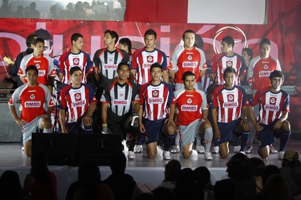
If there was a jersey that had a great deal of secrecy and Chivas jersey was it. Finally the jersey came out Wednesday night and lots of fans of the Sacred Flock were quite disappointed with their new kit.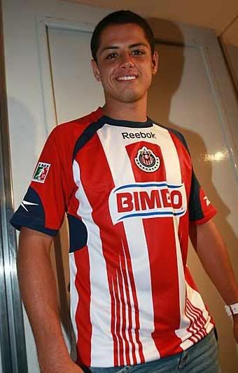
Reebok once again became the center of the design controversy for one of Mexico's most popular teams. Last year's design, to my humble taste was much better than this year's. The new kit sees the traditional vertical red and white stripes return- but with a twist. The red stripes are a bit thicker but in the lower part of the of the jersey Reebok has placed a "shredded look", not the best design in the world. The stripe located in the middle of the jersey stops just short of the collar in order for the designers to place REEBOK logo.
But what has really irritated Chivas fans is the tinkering of the team's crest. That has fans of the team up in arms. So much so is the case that a petition has been started through Twitter as well as Facebook in order to get the attention of Chivas boss Jorge Vergara. In the meantime, Vergara stated that the change in the crest was a "symbol" of the "evolution of Chivas".
The second jersey seems to be overstock from last year's Indios Ciudad Juarez kit. It's reddish-orange color continues the theme of Vergara and Reebok's fascination with orange. In Mexico, Chivas fans are looking up north in order to see the other Chivas side looking more traditional uniform.  Chivas USA, courtesy of Adidas, has maintained those values and patterns that fans in Mexico appreciate and long for at the Jalisco for the past three years. There is no doubt that they look much better. So after all of the hype and all
 of the glitz and glamour that Chivas generated, there was very little fireworks generated by this new kit. Dissappointing by a ton.
Let us know what you think.
Newsodrome

El Octagono

Listen to the best MMA podcast around...in español!!!
