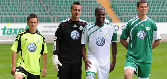
Three German teams recently unveiled their new jerseys and leave it to the new German champions to have the only jersey that I would actually buy. Wolfsburg's new kit's are FYAH! because there aren't any color changes and radical color mixing or designs. The Volkswagen logo has become a stylish symbol to put on a jersey, check out DC United's jerseys. The highlighter yellow color on the alternate 3rd jersey color is the only flaw in the bunch. The recent Bundesliga champions' new kits score an 8 out of 10, the color of the alternate 3rd jersey keeps the new Wolfsburg kits from getting a 9.
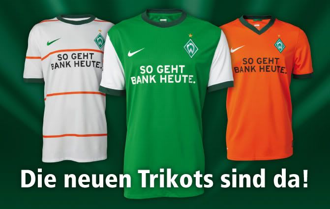
 Werder Bremen's new kits are not anything spectacular. The beaten UEFA Cup finalists new kits are more conservative than last season's kits. There are no or stripes in comparison to last season's kits. The skinny orange vertical stripes on the home jersey are more unnecessary than stylish but they don't make the jersey ugly. The road and 3rd jerseys have a solid color scheme that look good but nothing that you should buy unless you are a die hard Werder fan. Overall, Werder Bremen's new kits are nice but not eye-popping, 7 on a scale of 10.
 Borussia Dortmund's kits for the 2009-10 are a radical change from the 08-09 kits that had all kinds of stripes, slashes, and excess lines. The kit that stands out is the alternate jersey on the far left. It has a kind of space age, sun's rays look to it. Normally, a design like that doesn't impress but Kappa managed to pull off a unique look that the players won't be ashamed to wear. I feel sorry for the keeper who has to wear that light violet/dark pink shirt. Overall, Borussia's new kits get a 7 out of 10, good-looking designs but nothing that makes it FYAH!.
You can see more jerseys at Todo Sobre Camisetas.
Copyright 2009 | Simply Fútbol
Designed By Jinsona Designs | Customized By Walker Productions


