Español

Uruguay celebrate 60th anniversary of Maracanazo

Uruguay will once again remember one of the greatest upsets in World Cup history. Simply Futbol will remember The Maracanazo...
World Cup Grand Final Preview

Beyond the Pitch: Patricia Carlucho

Meet Patricia Carlucho. She is one of Uruguay's rising stars, at age 25 she has a long road ahead. Professional dancer, fitness instructor. Another beauty from El Rio de La Plata....
Beyond the Pitch: Patricia Carlucho

An Ode to a Madrid Great

The Santiago Bernabéu will be giving their greatest idol one of the greatest ovations ever as Raúl González Blanco will say farewell to the Real Madrid faithful ...
New Legacy Of The World Cup-Part I

Ronaldinho's legacy was celebrated at the Camp Nou

Nostalgia filled the air at the Camp Nou as Ronaldinho Gaúcho returned to his old stomping ground. What is the legacy he left behind?
Ronaldinho's legacy celebrated at the Nou Camp?
m
Showing posts with label Jersey. Show all posts

Barcelona show off next year's kit at Villa presentation

Posted by Juan Arango

Newly acquired David Villa became the first Barcelona player to appear wearing the new kit for next year. "El Guaje" has been the major storyline in Catalunya the past couple of days as earlier in the week it was announced that he would bolster a Barcelona attack that had the league's Pichichi winner as well last year's blockbuster arrival, Zlatan Ibrahimovic, Pedro, and Bojan Krkic.

Nike has come out with some rather controversial designs this short off-season. Champions League finalists Inter came out with their home and away kits for next season.

The jersey is one of the first club jerseys to come out with the revolutionary design based on recycled plastic bottles and the Dri-Cool system that has been talked about in jerseys like Brazil and the Netherlands.


The design is similar to the 2005/06 season when they won both La Liga and the Champions League with of course certain noticeable tweaks. Barca will remain with their traditional horizontal stripes but the shirt and collar are yellow. The collar is still round. Once again Nike is trying to go wide with the stripes, but in my humble opinion, the best kits blaugrana kits have been better with thinner stripes.


One of the new additions to the Barcelona jersey are the implementation of two famous club slogans. In the back of the crest on the left breast the motto "Tots Unim Fem Força" (Together We Are Strong) is sewn in. On the left sleeve the world famous "Més que un equipe" (More Than a Team) is found.The away kit is reminiscent of the 1992 jersey that was worn during their first ever run to Champions League. The aquamarine color is atypical for younger Blaugrana fans and change of pace for fans that have seen the yellow, orange, and last year's salmon alternates that surfaced in the past five or six years.


Photos below courtesy of FC Barcelona and Barcaloco

Check out Sport slideshow


Share/Bookmark

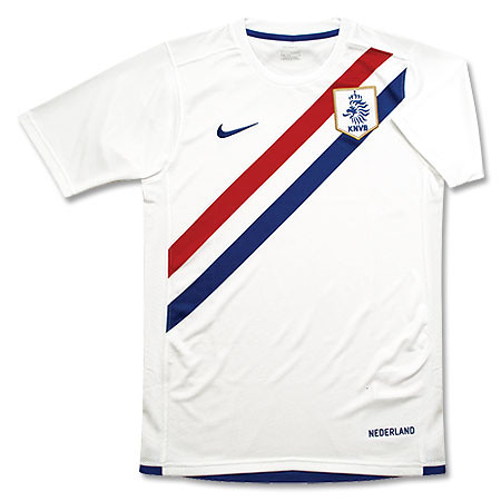
Product review: 2010/11 Holland away jersey

Posted by Juan Arango

The Dutch have had some of the coolest kits in the past decade.


From their humble beginnings back in 1905 to the days of Cruyff, Resenbrinck, Neeskens, and the Dutch sides of the 1970's to the last World Cup they have surely been ahead of the game with their color combinations as well as designs. Who said you couldn't be flashy and play spectacular football?

Ok, the teams of Gullit, Van Basten, and Rikjaard of that 80's could be excluded in the aesthetics department. That 1988 kit was a little too much for my taste, but we can forgive them. Hey, they did win the European Championship that year with that jersey.


The Dutch crest (Nike)

Even the relatively anonymous 2002 away kit was one of the best. Unfortunately the taste of Louis Van Gaal's failure will be etched to that design despite having one of the best away jerseys then. to today, their second kits would are some of the best around.

The Design

This edition of Clockwork Oranje is no exception. Nike did a great job of using their current design with the Dutch flag colors. This is in ways a tribute to that 1905 team that beat Belgium 4-1 in their first-ever match. Although it is not as true in design as the original, as compared to the In previous versions of the away kit, Nike was able to give the red, white, blue and as they bring to the fray some revolutionary and ecologically conscious designs for their jerseys.

The new white away shirt has an extremely modern look. The blue round neck, white red and blue thin strips of V-pattern, reminiscent of the Dutch flag. On the back collar shirt the word “Nederland” pattern on the inside collar decorated with fine Dutch side of the flag.

Netherlands crest is embroidered on the left breast, while on the inside lining of that same crest the words “Oranje Leeuwen” (Orange Lions) are embroidered. The design of the font used by the Dutch artists, well-designed, outline of a majestic lion head. Jersey numbers makes it very unique. The design is inspired by the intersected directions of the canals in the historic city of Amsterdam.

Each jersey come with a tag of authenticity on the bottom left.

All of the jerseys have been made from recycled plastic bottles (eight to be exact).

Their away jersey exudes the greatness that the founders of Total Football have. Although it does not have the mystique behind those revered oranje jerseys, they are still as elegant as they have always been.


The Verdict

Overall there were no problems with the Nike jersey. The jersey fits very well and is very comfortable. Trust me, to have a try this jersey out is a true test for those anyone that is looking to see if Dri-Fit technology works. As promised, the Dutch jersey took away the perspiration from the skin and allowed me to be cool. I was very skeptical at first, but the proof was in the pudding- actually in the shirt as when I wrung it the sweat came pouring out.


Overall the experience was a pleasant one. After years of having to wear stuffy jerseys in the humidity of South Florida. This area is without a doubt a true testing ground for these types of jerseys as days that are 85 degree fahrenheit (29.4 celsius) with 80-90% humidity are here on a year-round basis. That will definitely not be the case in the World Cup in South Africa will be the first winter solstice World Cup in 32 years.


So players like Wesley Sniejder, Ryan Babel, Robin van Persie, Rafael van der Vaart, Arjen Robben, and Edson Braafheid, the new Nike kit will have them dressing the part of contenders. It will be up to them to take that next step and make history by winning the Jules Rimet trophy in South Africa.


If you want to get the Netherlands away jersey or the Brazil home jersey check out SoccerPro.


Related Articles


Share/Bookmark

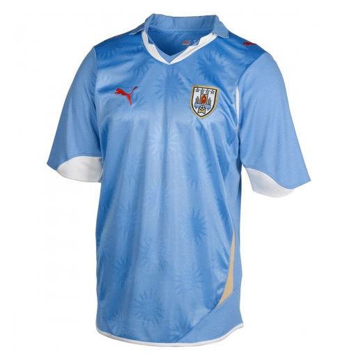
Uruguay jersey undergoes vast improvements

Posted by Juan Arango


The new Uruguay jersey(TSC)


After our friends at TSC divulged the Uruguayan jersey a few months ago, the South American country was ready to go into riot mode.

Puma listened and they went to their lab and made some adjustments.

First of all they corrected the mistake with the red print and used white, a more traditional color for La Celeste. Yes, they had been using an alternate red kit and Puma wanted to maintain the color in the overall scheme. That pattern failed miserably and now the white fits much better.

Where I am not a big fan is in the watermarked suns that remained on the shirt.
Uruguay looked very elegant in their debut against Switzerland midweek.


Share/Bookmark

New jerseys for River Plate in 2010

Posted by Lucas Lugo


Adidas and River Plate could unveil a new jersey for 2010, sources say that this new design could be unveiled before the World Cup in South Africa. This could be one of the first times that River moves away from the traditional design they have been using for the past few years. It is still uncertain is Petrobras will remain as the main sponsor, since their contract with the club expires in June.

The new design features two different sleeves; one follows the white pattern of the jersey, the other one is in red, matching the band across. The neck outline continues to fade into the chest area, this follows some of Adidas' new patterns in jerseys.

For the away kit, Adidas has chosen an all black kit, with a white neck outline and a red patch in the right side. This shirt moves way from the traditional design in which the jerseys had the red band across it.


Source: www.todopasion.com.ar


Share/Bookmark

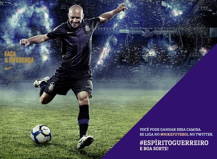
Corinthians third kit is roaringly successful

Posted by Juan Arango


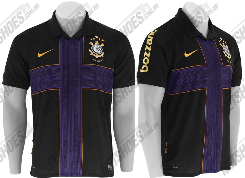
One of Brazil's most popular teams is throwing the kitchen sink at the world market as Corinthians celebrate their 100th anniversary. Nike is giving them one of the most elegant kits out there and to put the cherry on top, Corinthians presented their elegant third kit.

The purple and black color combination is extremely elegant and add the cross and it does bring back memories of the Inter jersey that was used a few seasons ago as they, too, celebrated their centenary.

The jersey is a combination of two alternate color combination kits that have been used by O Timão in recent season after they returned to the top flight of Brazilian football.

The new third kit has a cross that is used in a template similar than that one that Boca used a few weeks ago as the released their 105th anniversary kit.

The touch of class is added by the gold trim around the cross as well as in this year's crest. The gold lettering of Bozzano on the left sleeve does not take anything away from the jersey, on the contrary it adds a little bit of spice in a sleeve that really has little going on.

The cross has a more elaborate design than the Inter jersey and it offers a great deal to the design, adding elegance everywhere.

If there is one thing that you could criticize about the jersey is the insertion of the NeoQuimica sponsor logo in gold that drowns out the cross effect in the jersey, which is what makes the jersey stand out in the first place.

So where you are a fan of Brazilian ball or not, Corinthians has captured the imagination of a footballing nation as they go for the one big trophy that is missing in their incredible collection of silverware.

Between the acquisitions and the build up to the Libertadores being advertised for well over a year, one thing is for sure, they will look really good in the fight.

Thanks to TSC for the photos


Share/Bookmark

Puma's Uruguay jersey leaves much to be desired

Posted by Juan Arango


Our friends at TSC received over 141 comments regarding the Uruguay jersey for the upcoming World Cup. All we can say is that it is a tremendous regression from the kit that they were using during the qualifiers.

Not a good move by Puma as Uruguay did not use the African templates that generated a great deal of acclaim. Instead they will go with the more European design that teams like Switzerland, Austria, and Czech Republic as well as reigning champs Italy will use for the remainder of this year.

The watermark suns all throughout the jersey did not bring in several fans and the color scheme was not one to attract hordes of people either. The back of the jersey will look very weird with the typical sky blue mixed in with red, white, and beige trim.


The beige alternate jersey also left many heads scratching as Puma was trying to make an effort to recreate the same kit the Charrúas wore 60 years ago when they made history at the Maracanã.


Share/Bookmark

Boca present 105th anniversary kit

Posted by Juan Arango

Federico Insúa was part of the presentation that of Nike's 105th anniversary kit and the excitement reigns prior to a presentation in Boca's pre-season training site in Tandil.


The new Nike kit will bring back the pure colors of the club as there have been variations in the shades over the past decade. The time the uniform was at its most famous in the cash registers was when it was at it lightest.

Boca will also replace their current crest with the crest used between 1920-1955.


The uniform look gives tribute to the country that offered the inspiration for the Xeneize colors. Legends attribute this color scheme to a lack of indecision of the original club founders. They finally decided to go to El Riachuelo and decide on the colors based on the flag of the first boat that entered the port.

A Swedish ship came in and that gave way to the beginning of the legend.

Check out presentation video


Share/Bookmark

Racing Club present their new Olympikus kits

Posted by Juan Arango

Racing Club change outfitters yet once again, but this time it was a good thing.

Their move from Nike to Penalty was short-lived as the jerseys did not pan out as well as originally thought.

Once again, the Argentine clubs know how to present jerseys, mixing hot women with the actual clothing.


[racingpresentacion4.jpg]

[racingpresentacion2.jpg]


http://i312.photobucket.com/albums/ll349/Todosobrecamisetas/flamengo.jpg
The Brazilian outfitters used the same template with reigning Carioca champs Flamengo as well as with Copa Libertadores-bound Lanús.


Share/Bookmark

Boca's Jersey Presented Amid Protest

Posted by Juan Arango


A club like Boca is one that is always susceptible to igniting passions from fans and enemies. Their return from Europe has been upstaged by the current situation in Argentine football.


Now with everything "back to normal" the biggest scandal in the world that is Boca was all the controversy with their jersey. After several hold ups and uproar among one of the most fervent fans in that country, the Xeneizes opened a Pandora's Box.

This year's sponsor, LG, did not consider color patterns and fans have proposed a "remerazo" (jersey boycott). How bad could it be?

Well if you see the front of the jersey, you could probably figure out why. I mean, what if they lose to River Plate? Could you imagine the jokes that are going to be made. I mean this wold be like something similar to the jersey that they began selling for the club's centenary.

River would NEVA put blue and gold in their stadium, much less their jersey. Well, that is a sign of the times because for the boys for La Ribera are worried more about the money that they generate from a sponsor like LG. "Close to three million dollars during the life of the deal with LG," said club president Jorge Amor Ameal. Which ever side you are on in this argument the jersey is elegant as well as old-school at the same time.


The Nike Fit was once again a hit as the American outfitter has been able to add a few feature to this year's first jersey. The crest will come with 50 stars this year after the club won the Apertura in 2008. The three stars on the top of the crest symbolize the three Intercontinental titles that the Argentine side have won in their history.

On the left side Nike placed a tag that says "Republica de La Boca Buenos Aires", thus adding to the Boca lore and identity to their neighborhood.

All in all, Boca 's jersey is very elegant, although the sponsor left them wide open to become the butt of many jokes.

Special thanks to TSC for their help and information.


Share/Bookmark

Greatest Jersey Presentation EVER!!!

Posted by Anonymous

I am only going to say this. The Velez people are geniuses. This is the Greatest Jersey Presentation EVER!!! Enjoy. I can't type too much cause there is hardly any blood in my brain.


Just for this presentation, Velez is a nominee for Team Of The Year.


Share/Bookmark

Parma's New Throwback Jerseys

Posted by Anonymous


Parma FC's new kits for 2009-10 are in and the verdict vfrom El Negrini is an 7. The shirt on the left is the home jersey and is a reminiscent of Inter's 3rd kit from a couple of years ago. Although the black colored cross is much better looking than Inter's red.

The one in the middle is the alternate and I likes. I'm a big fan of stripes and Parma's colors make the stripes work, the only thing I don't like is the epaulets on the shoulders. Errea should have let the stripes ride up to the shoulder but overall its something I'd still wear.

Now the road kit in the middle on the right side is where the overall presentation loses some points. My issue are the sleeves, the shirt template is based on the 89-90 Umbro shirt, worn by Parma in the year of its 1st promotion to Serie A. If the base of the shirt were white like in the picture below it could work.
parma-errea-celebrative-shirt-3.jpg
However, in the picure in the very top the jersey's base is blue and its looks funny. Real talk, it looks like a circus shirt when the base of the jersey is blue. Overall I like the kits and give them an 7.


Share/Bookmark

New Racing Kit Moderate Surprise

Posted by Juan Arango


After a two-year deal with Nike, Racing Club decided to go in a different direction and opted for Brazilian outfitter Penalty. For many it was a huge gamble, but after seeing the final product, it is safe to say that the Argentine side made a great choice.


Share/Bookmark

Did Fiorentina's Kit Change?

Posted by Juan Arango


Fiorentina had a summer full of speculation regarding their new kits. That all ended when it was announced that the Italian side would sign an extension with Lotto.


Apparently, the Italian outfitter did not put enough time into La Viola's kit as compared to Udinese's.

Status quo. That is what describes the kit that never changes. It at least seems that the team's jersey looks exactly the same from the time that Batistuta first arrived onto the scene. Not mouch has changed.

Fiorentina deserves better. A team with the history and a fanbase that is among the most passionate in Italian football deserves more than this by Lotto. Although they did a magnificent job with Udinese, the template failed them this time around with one of the more historic teams in Serie A. If there was more time and effort, Fiorentina would have been sensational, unfortunately they will have a dud of a kit for this coming season.


Share/Bookmark

Stop Kissing Jerseys!!!

Posted by Juan Arango


Kissing jerseys has become part of the entire marketing ploy in player transfers. We all know they don't mean their allegiance to a club when they do that. It's the equivalent of declaring eternal love to woman when everyone knows all you can offer is a one night stand.


Share/Bookmark

Indios Kits Convoluted

Posted by Juan Arango


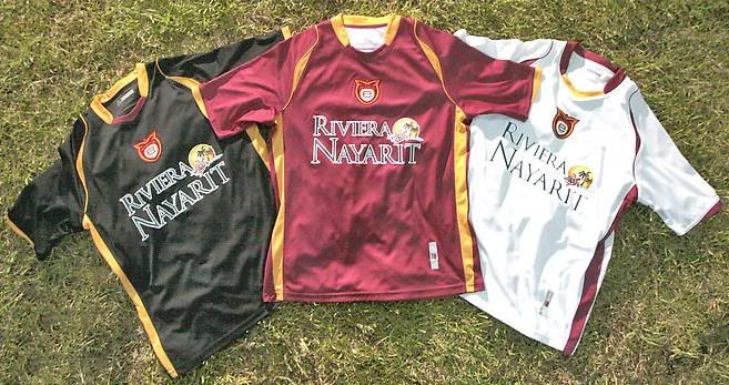
After their magic carpet ride into the semi of the Mexican Liguilla, Indios have found people to sponsor them and they were not shy to show their appreciation... to each and every one of them.

Not even the use of external aesthetics and beautiful models could not hide the fact that Indios Juarez' newest kit is just enveloped in ads. Although would prefer to look at the models, I was not able to find the team's crest. Is that a sign of the times in Mexican soccer?

Amid the models with geisha and punk hairstyles, the kits designs are good (especially the away unis) but they get upstaged by the propaganda.

Thanks to TSC for the photos.


Share/Bookmark

Pumas Debut With Puma

Posted by Juan Arango

The reigning Mexican champs made a splash in Mexico City on Wednesday night as they presented their new line with German outfitter Puma. Long gone are the days where Lotto was their designer of preference.

So top secret was the information about this new jersey that when they went to Los Pinos to go visit the president, Felipe Calderón, he was given the "old" jersey. So no exclusive even for El Presidente.

So behind all the pomp and celebration of the club's history as well as their titles, Pumas divulged to the world what they not have and it is quite impressive. The kit will be part of the jersey that will commemorate the club's centenary and there were a few little knick knacks that will make this jersey so unique.

There is a combination of past, present, and future in this jersey. The traditional Puma on the front of the jersey will remain, but with a different texture. The design of the first jersey (white) is not benefited by this while the others seem to fall in place with the Puma template that has been so effective with other clubs. The color scheme of the first jersey in combination with the pattern is what kills it and overdoes. If you start to look at the second jersey (blue), third (gold), and the goalkeeper outfit the pattern favors these designs based on their color schemes more because they are more subtle.
Then there is also the exclusive "100 years" on the left sleeve that signify the special occasion for the Mexico City club. Puma passes with a C-, I don't think that they obtained the true essence of what the fans were looking for and instead went way out in left field to go for the overly spectacular; not achieving that in the process. My friend Marc will be the ultimate test of approval and he is not as nice as I am .


Share/Bookmark

Tecos Metamorphosis Continues

Posted by Juan Arango

Tecos decided to completely change their identity and start to head in another direction.


For many this team has been the third fiddle in the city of Guadalajara and seem to have become fed up with that notion, so they are now doing something about it. After changing their name, they also changed their crest with the
tecolote, the native Mexican owl from what it was originally.


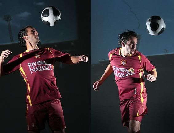
That was seen in their new uniforms. They are following the steps of Real Betis of Spain and using their starting up their own outfitter and hopefully obtain similar results. At first sight, Estudiantes Tecos' new kit appears to look like AS Roma's with the color scheme as well as the design. For Tecos fans it is a return to the 1970's when Tecos was wearing this same color scheme continuing the trend of Mexican sides that are looking to the past as is the case with Club América.


Share/Bookmark

Nike Makes Monterrey Fans Reminisce

Posted by Juan Arango


Nike will begin a new era in the partnership with Mexican side Monterrey this coming season. The kit overall is very impressive and the moment that fans saw it a the official presentation fans were getting flashbacks.
The American outfitters templates are pretty much the same with this style but the one tweak that they made was all the difference they needed in order to impress fans. Nike went back to 1986, year that Los Rayados won their first title, and once again added the red trim to the jersey. The first jersey continues to have the traditional white and navy blue stripes, but there is a minor detail that Nike added and it's the implementation of a red outline on the stripes. The stripes give the jersey more depth and also that like spice of change that kits need every so often.


The second kit is a return to a more classic style. Nike departs from last year's sky blue and goes for the more traditional white alternative with pinstripes. At first site you would confuse them with Brazilian side Corinthians. In this uniform the "necessary evil of sponsors blends in a little better as compared to the first jersey where Bimbo's logo looks ironed on and sticks out like a sore thumb.

So is there a sign in the air that Los Rayados are favorites to win the upcoming touranment? Well, as topsy-turvy as the Mexican League can be there is no doubt. One thing is for sure, Nike will surely have this side looking like champions.


Special thanks to TSC for the heads-up.


Share/Bookmark

World Cup Commercials

Call Simply Futbol

SF Partners

Audio Player

Newsodrome

Newsodrome - Niche News, Top Stories